Make A Responsive YouTube Video (Embed) Using HTML and CSS
Updated: June 7th, 2022, 11:45:12 IST
Published:
June 7th, 2022
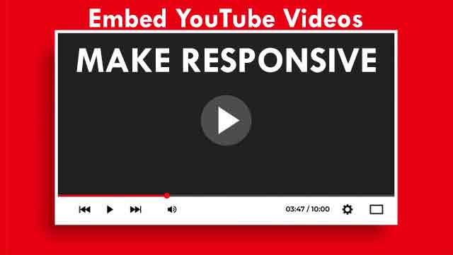
We will make video responsive with CSS and embed HTML code using iframe. Basically, we will create a div with class container around it. Apply CSS code to the HTML to make it responsive video.
HTML CODE
<!DOCTYPE html>
<html>
<body>

<div class="container">
    <iframe src="//www.youtube.com/embed/s8DgOeKSPuk" width="750" height="563"></iframe>
</div>

</body>
</html>
CSS CODE
.container {
    position: relative;
    padding-bottom: 56.25%; /* - 16:9 aspect ratio (most common) */
    /* padding-bottom: 62.5%; - 16:10 aspect ratio */
    /* padding-bottom: 75%; - 4:3 aspect ratio */
    padding-top: 30px;
    height: 0;
    overflow: hidden;
}

.container iframe,
.container object,
.container embed {
    border: 0;
    position: absolute;
    top: 0;
    left: 0;
    width: 100%;
    height: 100%;
}